Sunday, April 26, 2015

If You Think You Can Grasp Me.....

I happened to be looking at the wonderful spread Chris recently posted, and saw a mixed media site I'd not known about.....and this month's challenge invoked the use of poetry.  Bliss!!

I
April is one of my favorite months in the states though certainly not for the weather this year, lol!

No, I love April because it is our National Poetry Month.  The publishing house Knopf even has poem-a-day email service for anyone wishing a bit of daily literary artistry in their inbox throughout the month.

I collect bits of writing and poetry that appeal to  me when I come upon them, and some time earlier this year I found a wonderful piece from Adrienne Rich, one of my very favorite writer/poets.  The work references the flow of diversity in an individual's life as a river delta, and this has stuck in my head for some reason.  I've been looking for a reason to incorporate this poetic slice into my work, and the challenge at Art Journal Journey seemed a good fit.

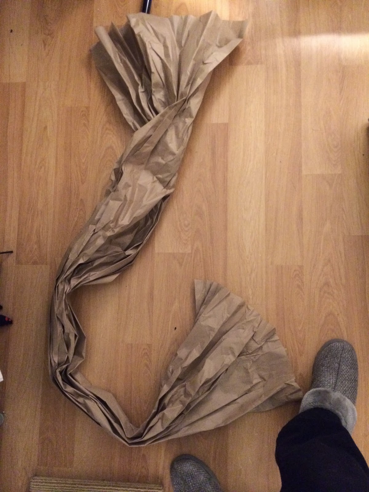
The delta analogy resonated when I happened to notice the beautiful flow of packing paper I'd left out for my cat to play with.


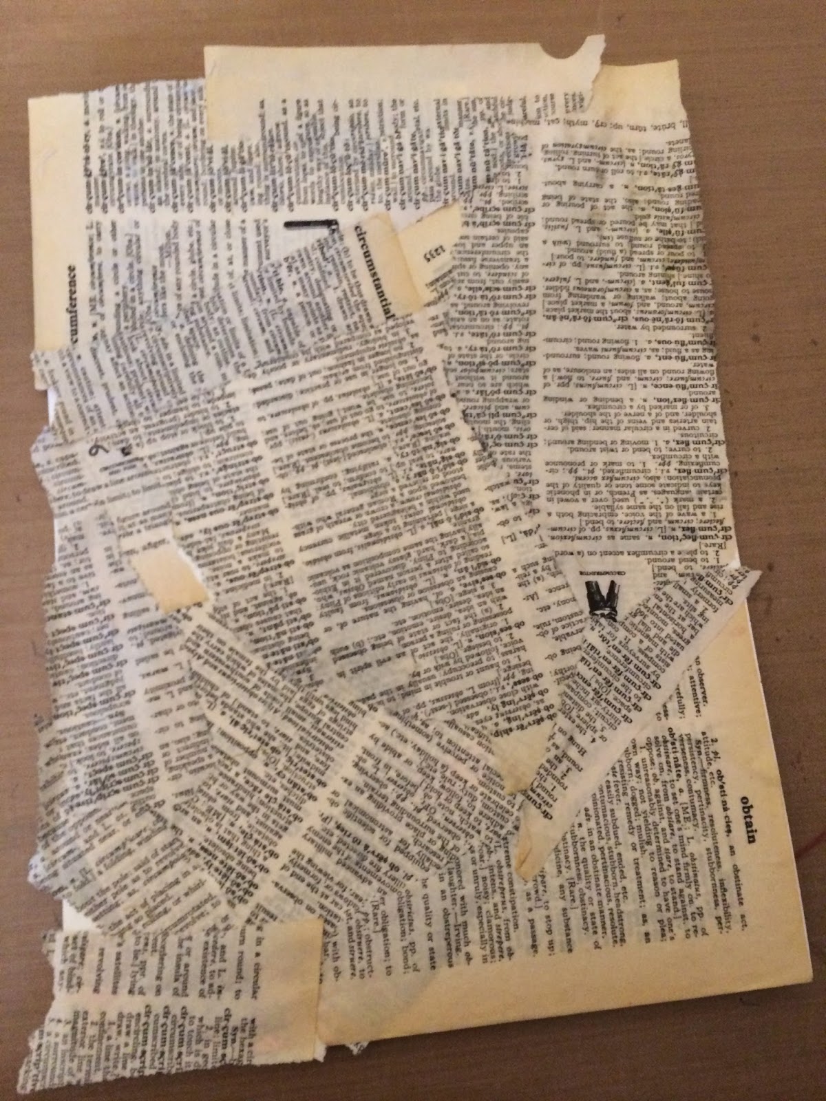
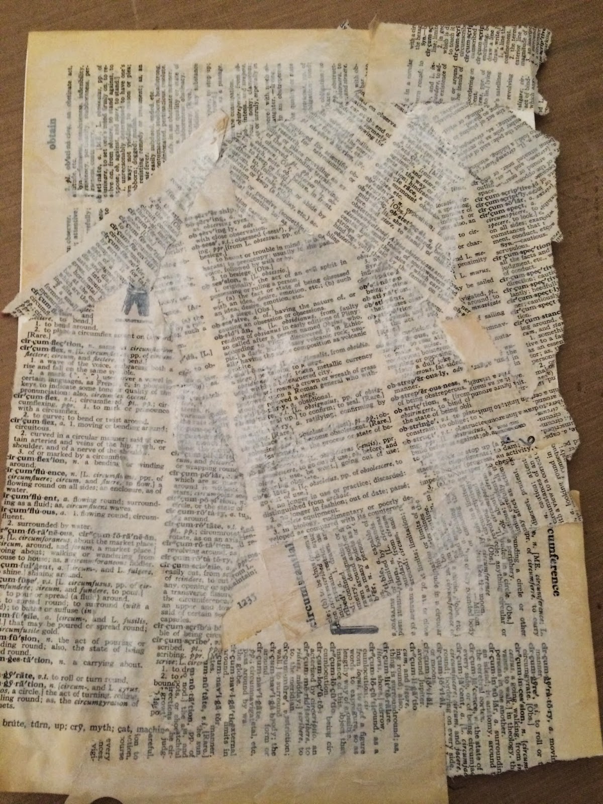
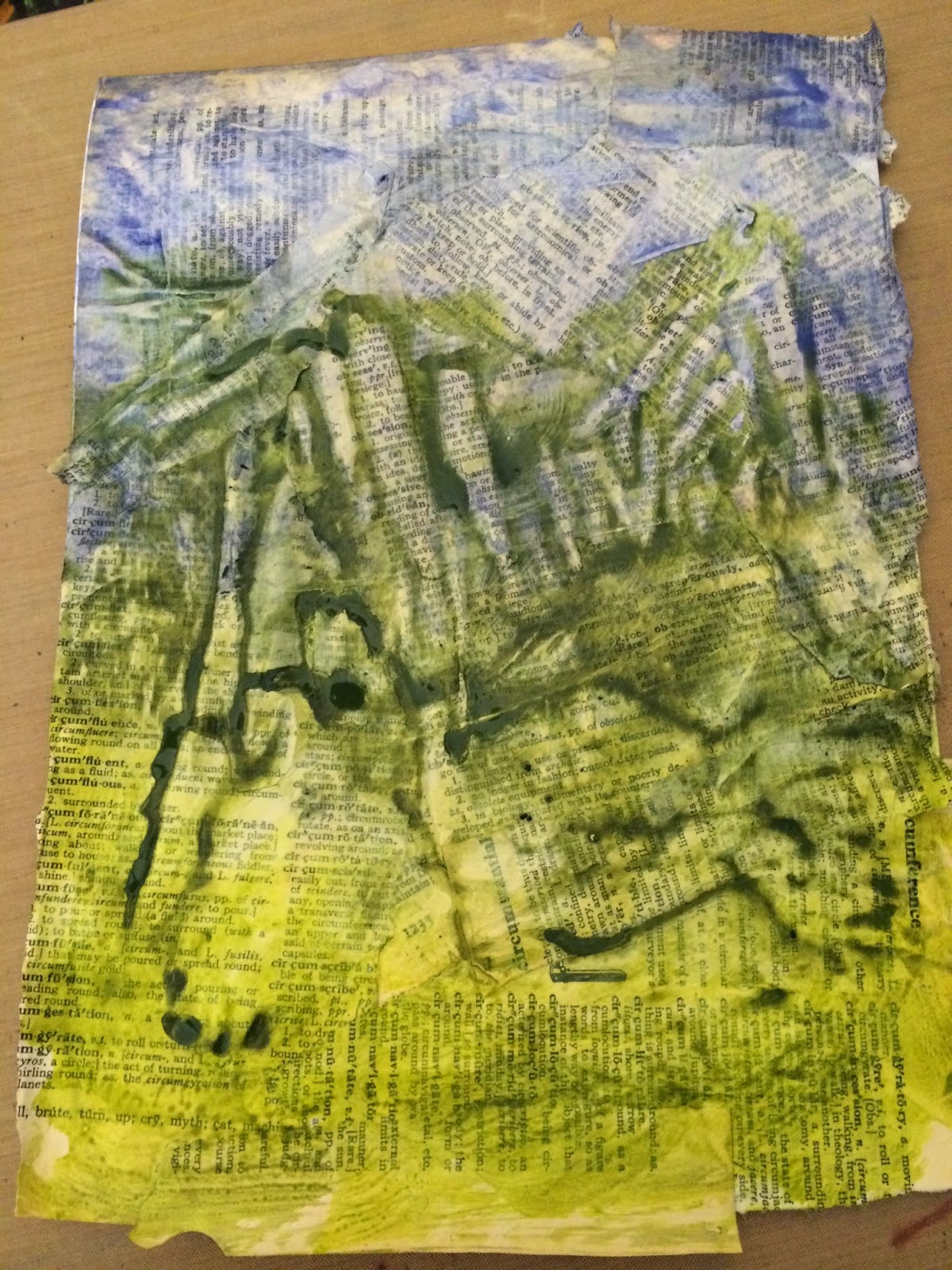
And I already had in my mind a background of blue sky and green fields, through which a river might flow.  Basic composition in mind, I started with tearing dictionary pages and adhered them with Ranger's Glue N Seal to a piece of Bristol Vellum.  

I randomly brushed on clear gesso, and then applied regular gesso with a dry brush.


I then colored the whole lot with watery washes of Golden's Smalt Hue and Green Gold transparent acrylics, mixing the two colors in the middle.


I crumpled a piece of copy paper to emulate the flow of the original inspiring packing paper.  My first attempt didn't suit, so I spritzed it with water and continued....but the consequential paper breakdown was not what I wanted here.  

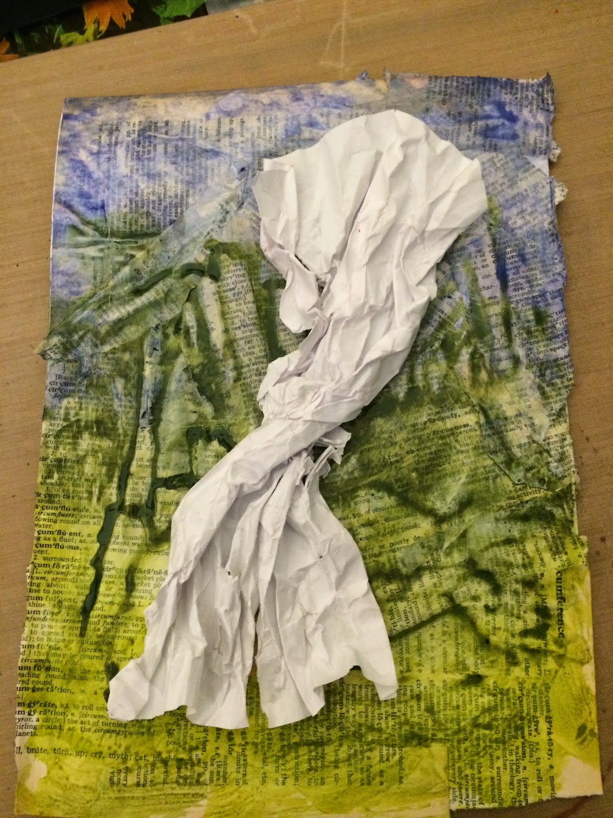
So I started again, this time crumpling the copy paper first to break the fibers down a bit, and then folding it into accordion pleats, very imprecisely - I wanted an organic feel.  After flattening it out again, I sprayed the paper with Faded Jeans, Chipped Sapphire and Weathered Wood for the blues, and Cracked Olive, Peeled Paint and Mowed Lawn for the greens - all mixed with generous sprays of water.


Once dry, I again casually fan-folded it, and twisted the middle.  I adhered it to the background with hot glue.


I did not like the faint colors of the dried piece, however, so covering the background with deli paper, I used Vivian's dousing technique by spraying the folded paper heavily with water and then applying Dylusions Dirty Martini and After Midnight sprays directly from the bottle with the spray tips.


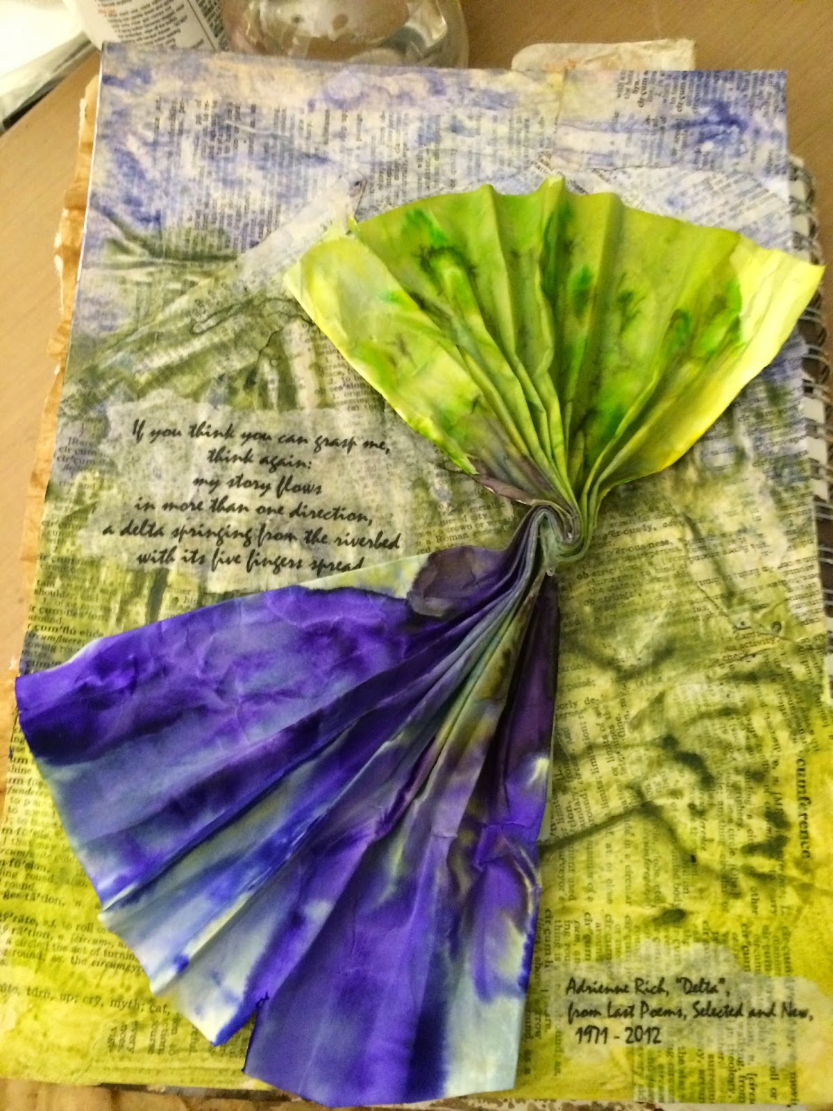
The poetry slice (and attribution) were printed onto tissue paper, and adhered to the page with Glue N Seal and lots of water.  


Thanks so much for visiting, and please do leave a comment if you've time - I love hearing what you think and appreciate your critique!

xx Lynn

Saturday, April 25, 2015

Eco Printing from Margie's Yard


My neighbor, Margie, is a wonderful gardener, and her spring gardens always look so inviting as the first of the bulbs show their full glory.  As I live across the street, I have a premier view!  Inspired by the eco printing techniques used by Diana Taylor and Marilyn Stevens, and having Margie's permission to cut flowers on their way out,  I decided to try my hand, using a graniteware canning pot with the jar rack and two wall tiles.


Nothing made from them yet, but love the images.  Note to self:  Layer so that the next layer is a NEW piece  of paper :-)  I did not do this, and so have beautiful images on both sides.  I thus will likely make a small book so I can enjoy them all without having to select which I like better!  I am also curious to try soaking the paper first, and using alum which may have a nice effect on the colors, per Diana Trout.

Thanks for visiting..... look forward to posting some makes soon.   xx Lynn


Thursday, April 16, 2015

Crow Mother


Well, I went down a lot of rabbit holes pursuing this piece, and finally ended up where I started, lol!  Although I live now in northeastern US, where there are wonderful flowering bushes, trees, and bulbs this time of year, April nonetheless invokes for me a very different scene!  I was born and raised in the American Southwest, and the Native American artistic and spiritual traditions have had a strong influence on me.  


So this spread arises from that background.  The left attempts to represent the amazing rain storms that come through in the spring.  Because it is so dry (relative humidity of 20% or so), often the rain starts to fall but evaporates before reaching the earth, a phenomenon known as virga.  In the early morning it appear more blue, as I have made it. 


The sky was made by applying gesso with an old hotel card key, and tapping up and down to put a lot of texture into it:


 and then washing with watery Smalt Hue and Quinacridone Violet.


The brick pattern represents the pueblos of the Hopi Indians, who traditionally lived on top of three high mesas, now in the middle of the Navajo reservation.  A lot of politics there, which I will not get into!  But here are some pictures of First Mesa and its surrounding environment.  All of this is sandstone, uplifted from the primordial ocean floor many millennia past.  Pueblo people (including the Hopi) build their dwellings like apartment buildings....for warmth and also to conserve space in a very tight area as seen below.   Notice how high up from the desert floor the village is.


And here is a picture that perhaps explains the colors I used.


I used Texturez Sand paste to emulate the brilliant colors in the baked mud bricks known as adobe from which the pueblos are built. When the Spanish first came upon the pueblos of the Southwest, they thought they truly had found their City of Gold!


The Hopi have a strong spiritual connection to everything in nature, not unlike early European beliefs.  The major spiritual figures are called Kachinas, and they live in the sacred mountains surrounding the area where the Hopi make their home.  At certain times of year, it is thought that the Kachinas descend into the villages to celebrate the harvest, or the naming ceremony when young men are inducted into the spiritual practices, or the time to plant.  The painting below depicts this type of descent.  


In actual practice, the descent is performed by spiritual leaders of the clan, wearing elaborate costumes that depict particular kachinas.  My favorite is Crow Mother, who comes when the seeds placed in a basket sometime in November have started to sprout - that signals the time for planting will soon arrive.  Below is a headdress worn by the person depicting Crow Mother.  Once in the village, Crow Mother visits each home, sprinkling the sacred corn meal as a way of blessing the family and their efforts for the coming growing season.


My second panel attempts to represent Crow Mother, and the newly sprouted melon, squash and corn seeds in the ceremonial basket.

The feathers are made of kraft from the Tim Holtz Flying Wings die and accompanying embossing folder, and then distressed with Black Soot Distress Ink.  I made a lot, but I couldn't get it to stop looking like a feather duster, so I ended up using only a few on each side.


The bricks were made by stenciling Weendy Vecchi White Crackle paste through a brick stencil, and once dry painting with Golden's Transparent Red Iron Oxide and Transparent Yellow Iron Oxide, both mixed with a generous amount of Ranger's Snowcap acrylic paint and lots of water.


The basket is made of crumpled Kraft Glassine paper, which has been shaped something like a basket.  It was then stamped in Wendy Vecchi Watering Can Archival Ink with a new stamp from Finnibair which is fast becoming a favorite.


The leaves are from card stock colored with Cracked Pistachio, Peeled Paint and Crushed Olive Distress stains, spritzed with a lot of water.  I think most of the dies are from Tonic Studio.


The final touches were a strand of turquoise beads (also sacred to Hopi, and worn by Crow Mother) and a piece I found in the jewelry department of my big local craft store that I thought sort of resembled the "head" part of the head-dress.  Crow Mother's symbol is a black equilateral triangle pointing down (or sometimes two of these)....but putting these on made the piece look even more like an alien from space so I removed those bits.


Here is a picture of a Crow Mother statue from my collection that hopefully helps you make the connection between my page and what I was trying to achieve!  And I hope the information about how this page came about made sense!


Perhaps the items from my rabbit holes will appear in future works - an abstract soil to sky based loosely on the ideas Alison was exploring earlier this year, some brightly colored Tattered Florals,  a little paper basket with seed packets which got changed to flowers, and a piece trying to incorporate the themes of about six challenges -  no wonder I got lost, lol!  

In the meantime, I will be posting this, as always, on Brenda's Visual Journey #16, and entering into the current Frillie and Funkie challenge to use spring time die cuts, the CountryView challenge to use kraft paper, and the Mixed Media Monthly challenge using the theme "April Showers".

Thanks so much for stopping by, and please do leave a comment if you've time - I love hearing from you!


Monday, April 6, 2015

Texture Paste for PaperArtsy!


I've been pondering what to do for the current PaperArtsy Grunge Paste challenge.  Alas, I do not have any of this fine product - yet!  However, I love using texture paste through stencils, to get an almost sculptural feel as in these recent projects:

as seen here   .............................. and here, but given all the wonderful examples Leandra showed in the video, this one technique did not seem to do justice to an exploration of the topic.

I was especially taken with "the wall tile guy" Chris Gryder's work, but knew I did not have the time or talent to attempt some sort of replication. I did, however, want a lot of texture.

While wandering a local branch of a national craft store chain, in which I always get lost looking for the die-cutting supplies, I ended up walking down the cake and pastry decoration aisles, in which I have NO interest being gluten free, low carb and not much of a baker in any event.

However, a large display of Wilton icing tips and their magical ability to transform frosting into a beautiful flower, leaf or decorative touch.......hmmmmm.


I reasoned that texture paste seems pretty close to bakery frosting in feel.  And as a fairly extensive set of tips was on sale for the Easter holiday, I jumped in with two feet - the set of tips, disposable icing bags, several additional couplers (whatever they do - just thought I might need them), and Wilton's Frosting for Beginners 101 Course booklet.  I also grabbed a large jar of Liquitex Modeling Paste and several 5 inch x 5 inch gesso boards, as I wanted a firm surface.

Once home, having figured out from the all-wise You-Tube what the couplers do (they help you change tips if using the same bag, which I would be doing), I loaded up a disposable bag and tried a few tips out on my craft sheet.


Not too bad, and not too hard....though I'll never win a decorating contest, lol!!  But fun, and I soon had my little gesso board covered with texture paste doodling.....